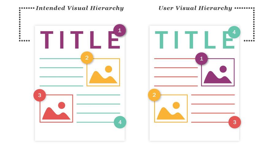
Visual hierarchy is the way designers arrange elements so users naturally understand what to look at first, what's most important, and what action to take next. It's basically the art of guiding attention. Because users don't read screens carefully like books - they scan, very fast. Within a few seconds their brain silently decides "this looks clear" or "this feels confusing," and that decision heavily affects user experience.
Situation 1: everything is randomly placed - no signs, no categories, no direction. You feel mentally tired instantly. Situation 2: clear sections, big category boards, important products at eye level. Suddenly finding things feels easy. That's visual hierarchy in real life - it reduces mental effort.
Users Don't See Everything Equally
Some things naturally grab attention first: bigger text, bright colors, high contrast, large buttons, images, whitespace, and positioning. Designers use these intentionally to create focus. In bad hierarchy everything competes for attention; in good hierarchy your eyes naturally know where to go first. That flow is intentional.
Why Visual Hierarchy Matters So Much
Without hierarchy, screens feel overwhelming, users miss important actions, readability drops, conversions suffer, and interfaces feel mentally exhausting. Good hierarchy helps users scan faster, understand quicker, focus better, and make decisions easily. That's why even simple layouts can feel "premium" - clarity often feels premium.
The Tools of Visual Hierarchy
1. Size Creates Importance
Bigger elements attract more attention. That's why headlines are larger, CTA buttons stand out, and pricing numbers appear bigger. Users subconsciously assume bigger = more important. Your eyes immediately land on the largest content first - that's visual hierarchy working correctly.
2. Color and Contrast Guide Attention
High-contrast elements naturally stand out - a bright CTA button on a neutral background instantly pulls focus. But if everything is colorful and loud, nothing stands out anymore. That's a common beginner mistake.
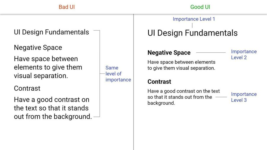
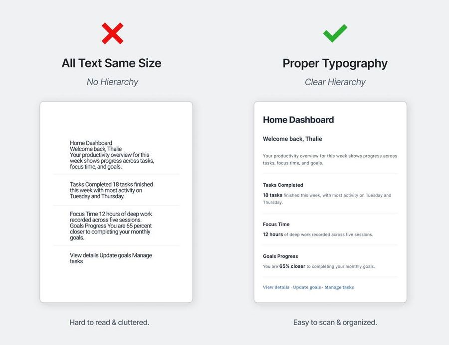
3. Typography Creates Structure
Typography is one of the strongest hierarchy tools. Using font size, weight, spacing, and alignment, designers create order. Without typographic hierarchy everything feels flat, and users struggle to understand headings, subheadings, and supporting text. Strong typography makes content easier to scan instantly.
4. Whitespace Is Not Empty Space
One of the biggest UX misconceptions is that whitespace wastes space. Actually, whitespace improves focus - spacing helps users separate information mentally. Crowded UIs increase cognitive load; good spacing makes interfaces feel calmer and clearer. Imagine a pricing page where cards touch each other and text is cramped, versus one with breathing room. The second instantly feels more usable - not because of aesthetics alone, but because the brain processes it easier.
5. Position Matters
Users naturally notice top sections, left-aligned areas, and center focal points first. That's why logos appear top-left, navigation stays at the top, and primary CTAs often appear near center. Design patterns follow human scanning behavior.
6. Grouping Creates Understanding
When related items stay close together, users mentally connect them - this is called visual grouping. A product title, price, and CTA button should feel connected visually. Poor grouping creates confusion.
7. Depth and Layers Add Focus
Modern interfaces often use shadows, blur, elevation, and overlays to create importance. Floating cards feel more prominent because layered elements naturally grab attention. But too much depth creates clutter - balance matters.
Visual hierarchy is closely connected to conversion. Good hierarchy quietly pushes users toward actions naturally, which is why companies like Apple, Spotify, and Airbnb obsess over layout clarity. They understand users decide quickly, and visual hierarchy strongly affects those decisions. Users usually don't notice good hierarchy consciously - they simply feel "this app feels easy." That invisible clarity is the goal.
Visual hierarchy is not decoration. It's communication. It helps users understand what matters, where to focus, and what to do next - without needing extra effort. And honestly, the easier something feels to understand, the better the UX usually is.