A CTA - Call To Action - is basically the moment where your interface asks users to do something: "Buy Now," "Start Free Trial," "Book a Demo," "Continue," "Download Report." Sounds simple, but CTA design affects user behavior more than people realize. A beautiful UI can completely fail if the CTA is confusing, weak, hidden, or overwhelming - because at the end of the day, users need clear direction.
Imagine entering a store. Everything looks premium. But nobody tells you where billing is, where the trial rooms are, or what to do next. You'd feel lost. That's exactly what happens in bad digital experiences - CTAs guide users forward. Without them, interfaces feel directionless.
What Makes a Good CTA?
Good CTAs are clear, visible, action-oriented, contextually timed, and easy to understand. Bad CTAs create hesitation - and hesitation kills conversions.
1. Be Clear, Not Clever
Designers and marketers sometimes try too hard to sound creative. "Let's Go!" - go where? Better: "Start Free Trial." Users instantly understand what happens next and what action they're taking. For a finance app, "Continue" is weak, but "Track My Expenses" communicates value immediately. Users don't want to decode interfaces - clarity usually performs better than clever wording.
2. Focus on One Primary Action
One screen should usually have one dominant action. When everything screams for attention, nothing gets attention. Six equally-highlighted buttons - Start Trial, Watch Demo, Learn More, Subscribe, Contact Sales, Explore Features - make users freeze. This is called decision fatigue. Strong interfaces visually guide your eyes toward one main action; that's intentional.
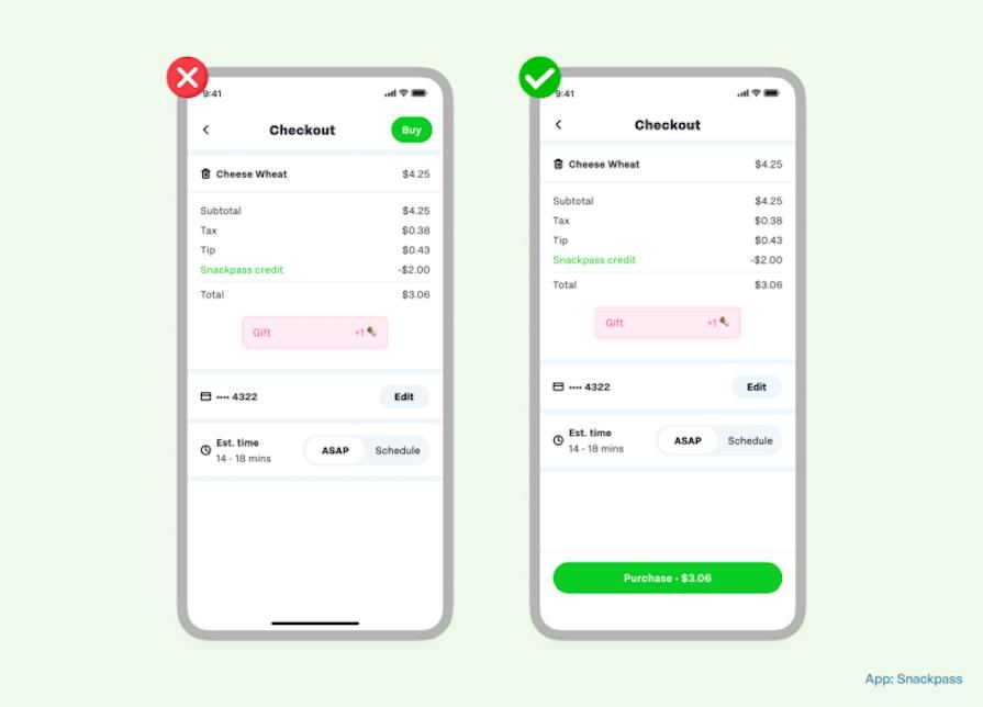
3. Make CTAs Visually Obvious
Users should not hunt for important actions. Common mistakes: low contrast buttons, tiny CTA size, blending into the background, too much visual clutter nearby. Your CTA should stand out naturally - not aggressively, just clearly.
4. Use Action-Oriented Language
Strong CTAs usually start with verbs: Get Started, Download Guide, Book Consultation, Create Account, Start Designing. Weak CTAs feel passive; action words create momentum.
5. Reduce Anxiety Around the Action
Users often hesitate because they fear commitment, payment, spam, or complexity. Good CTAs reduce that fear. "Sign Up" is weak; "Start Free - No Credit Card Required" drops uncertainty instantly. That tiny supporting text matters a lot.
6. Placement Matters More Than People Think
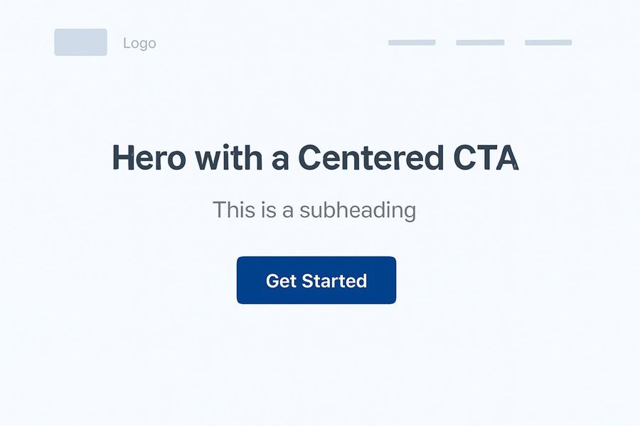
Even good CTA text fails if users never notice it. Good placements: above the fold, after explaining value, at the end of sections, near pricing info. A CTA should appear when users are mentally ready - too early feels pushy, too late feels hidden. Notice how the action usually appears right after the value explanation? That timing is intentional psychology.

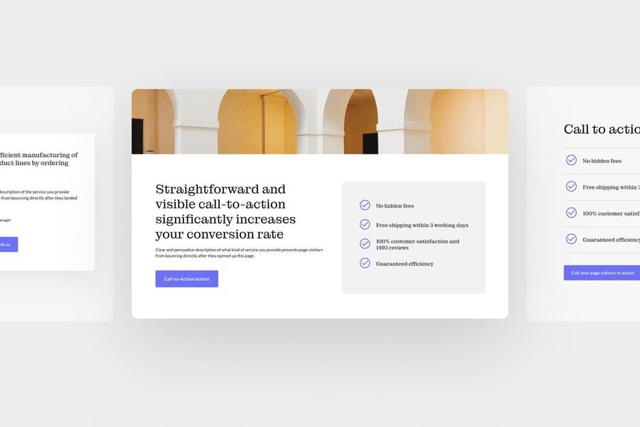
7. Create Visual Hierarchy
Not every button should look equally important. Usually the primary CTA gets the strongest emphasis ("Start Free Trial") and the secondary gets lighter emphasis ("Watch Demo"). This helps users understand priorities instantly.
8. Mobile CTA Design Is Different
Mobile users scroll fast, use thumbs, and get distracted easily. Important CTAs should be thumb-friendly, large enough to tap comfortably, and easy to notice while scrolling. Tiny buttons on mobile destroy usability.
9. Context Changes Everything
A CTA should match the user's stage. New user: "Learn More." Ready-to-buy user: "Upgrade Now." Returning user: "Continue Watching." One CTA doesn't fit every situation - good UX understands user intent.
10. Test Your CTAs
Sometimes small changes massively affect conversions: "Start Free Trial" vs "Try It Free for 14 Days," or a blue button vs a black button. This is why companies constantly test CTA performance. Netflix, Amazon, and Spotify all heavily optimize CTAs because tiny improvements scale into huge business impact.
CTA psychology is about reducing friction. The best CTA often feels obvious - users shouldn't stop and think "What happens if I click this?" Good CTA design removes uncertainty, which is why great product flows feel effortless.
A CTA is not 'just a button.' It's a decision moment where users silently ask: Is this safe? Is this worth it? What happens next? Good CTA design answers those questions before users even think about them.